Combined Jewish Philanthropies
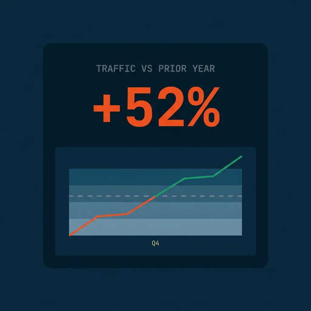
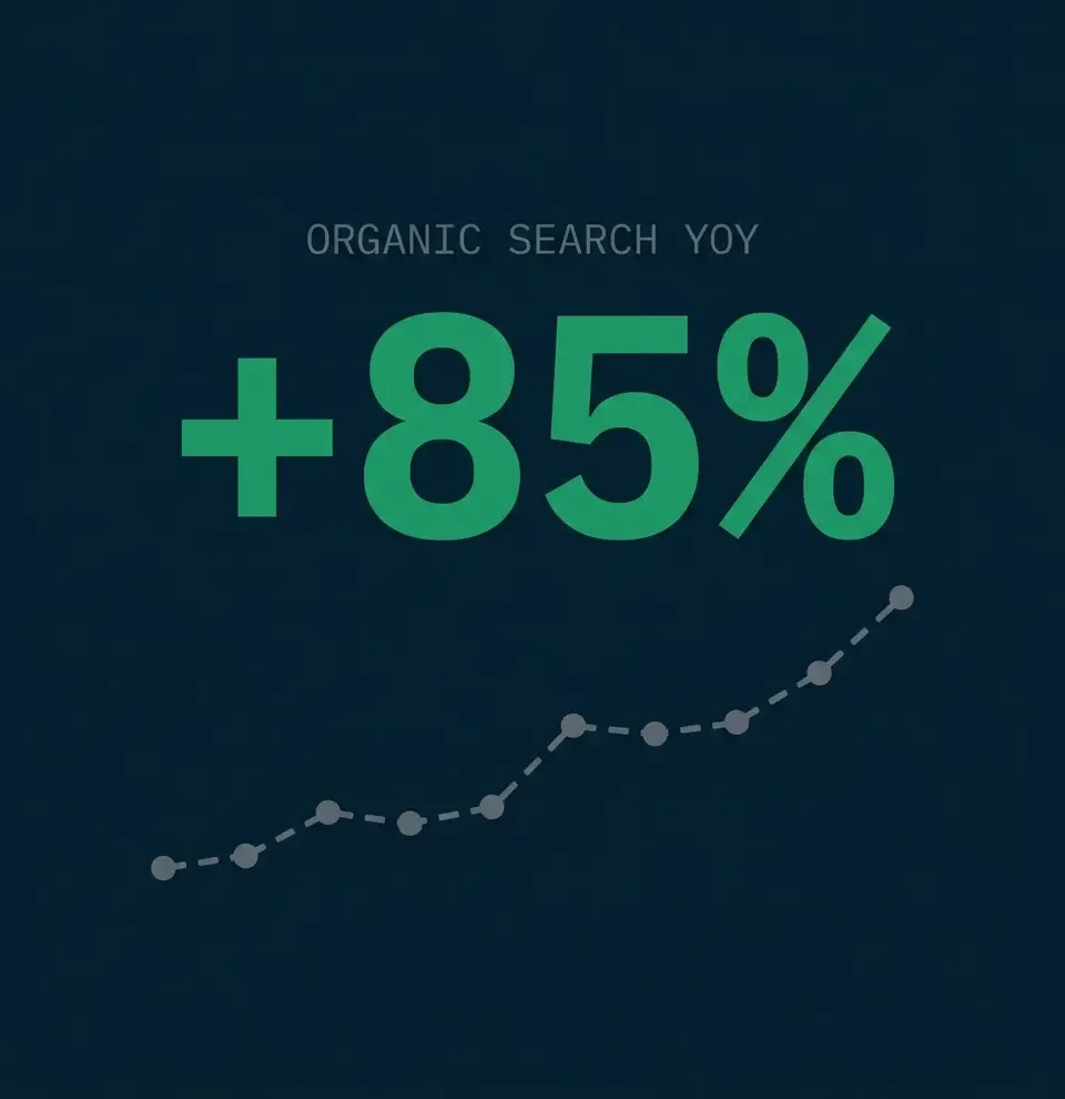
CJP is Massachusetts’ largest nonprofit and the center of Jewish life in Greater Boston, a century-old institution managing $1.9 billion in philanthropic assets. In late 2024, CJP chose us as their digital partner across the board: web, search, AI, analytics, email, content, and the donation experience. Together we launched an integrated cjp.org digital ecosystem, put the first AI research assistant any Jewish federation has offered in front of its community, and built an analytics engine none of their peers can match. Since launch, traffic is up 52% over the prior year, visitors stay 2.5x longer, and organic search is up 85% year over year.
Combined Jewish Philanthropies (CJP) is Greater Boston's Jewish federation and Massachusetts' largest nonprofit, a century-old institution managing $1.9 billion in philanthropic assets and serving one of the largest Jewish communities in America.
How We Helped Combined Jewish Philanthropies
Project Summary
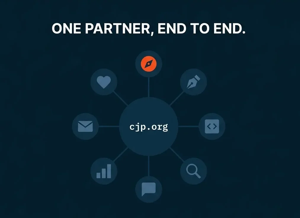
We were brought in to own digital end to end: strategy, design, build, search, AI, analytics, email, and the donation experience. The mandate: rebuild how Greater Boston’s Jewish community finds, reads, and supports its federation online.
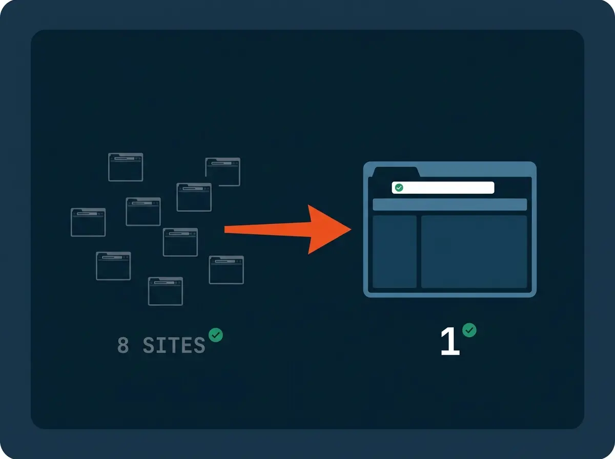
The new cjp.org went live in May 2026, with eight web properties consolidated into one platform and 300+ pages on a new design system. The community responded immediately: traffic up 52% over the prior year, average visits up from a minute and a half to nearly four minutes, and mobile visits more than doubled in length.
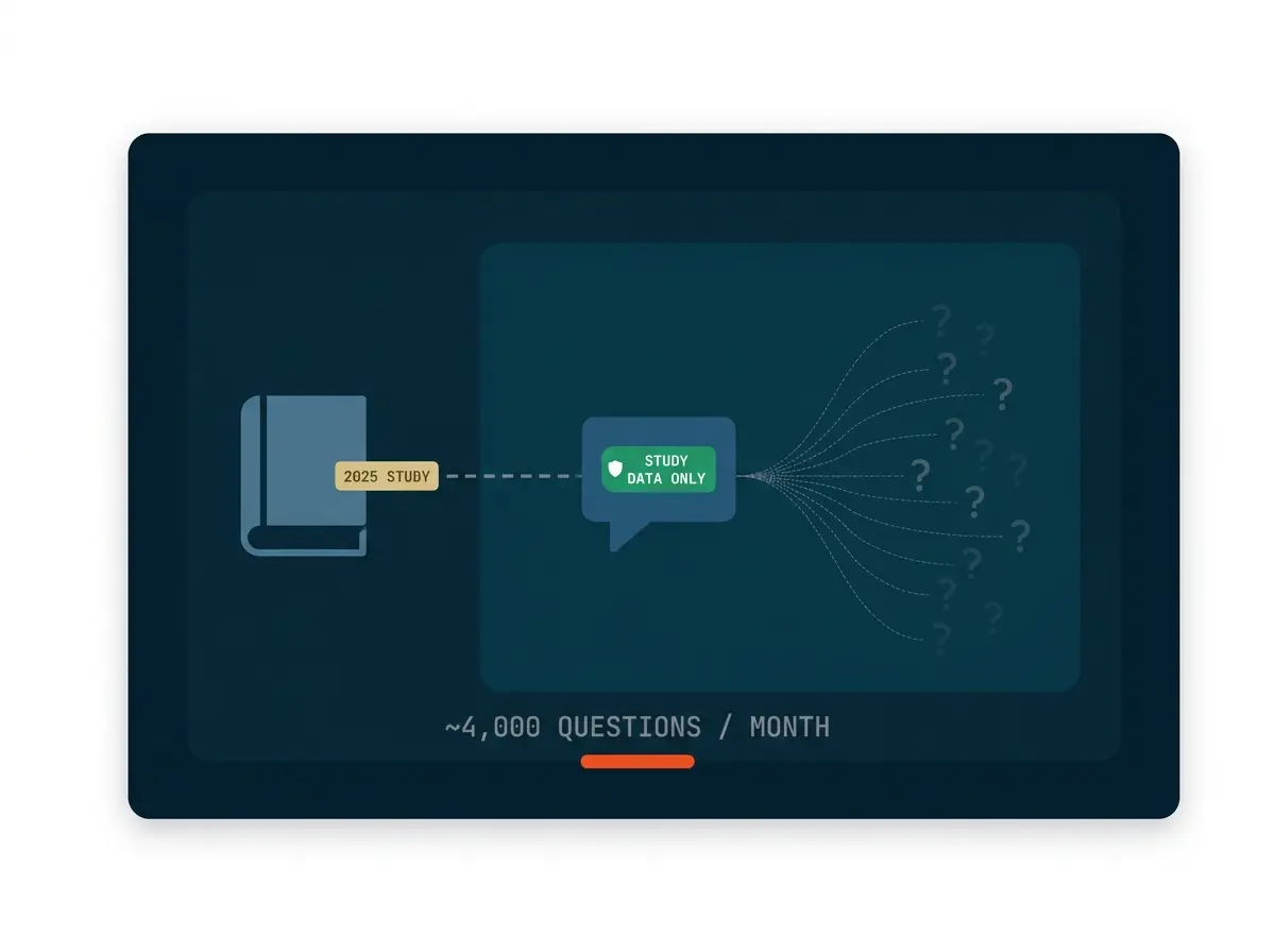
Before the relaunch came the 2025 Community Study, CJP’s once-a-decade research into Jewish life in Greater Boston. We built the study’s website and analytics, then helped launch the Community Data Navigator, a research assistant built on Claude that answers plain-English questions straight from the study data. The study site has drawn more than 8,000 visitors and 4,300+ report downloads, nearly 10x more engagement than anyone expected.
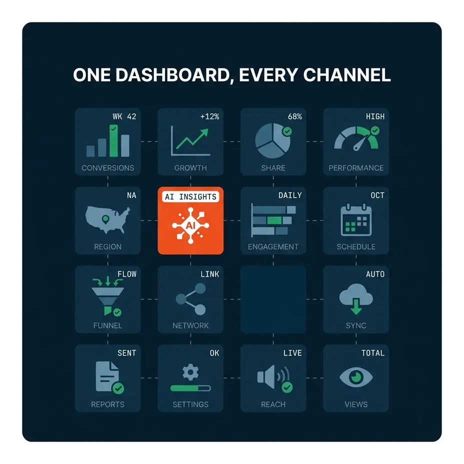
Underneath it all: a unified analytics ecosystem most federations don’t have. New GA4 and tagging built from scratch, a BigQuery data warehouse CJP owns, and one dashboard that shows what email, social, search, and paid actually drive, all the way down to the donation.
The Challenge
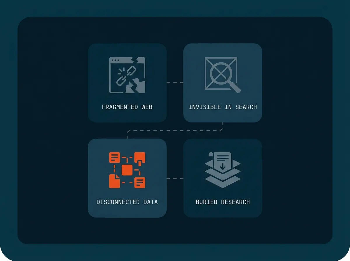
A Website That Didn't Match the Mission
CJP's community raised $59 million in an emergency. Meanwhile, its website was 15 years old, spread across eight separate properties, and organized around internal departments instead of the donors, families, and volunteers trying to use it. A century-old institution deserved a digital home that felt like one.
 SEARCH & AI VISIBILITY
 Invisible to the Next Generation
60% of CJP's search traffic was branded. Google only showed CJP to people who already knew its name. A young family searching "Jewish preschool Boston," or asking ChatGPT where to find community support, rarely found CJP. The donors CJP most needed, the 30-to-45 generation, were searching. CJP wasn't there.
Every Question Required a Manual Data Pull
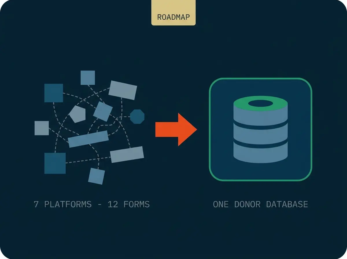
CJP's data lived in disconnected systems: multiple tag containers, multiple analytics properties, donation forms on a separate platform. Questions like "which email drove the most engagement last quarter" took days of manual work, and more than 50% of donors abandoned their gift somewhere across 7 platforms and 12 forms, with nobody able to see exactly where.
ONCE-A-DECADE RESEARCH A Study That Deserved a Stage
The 2025 Community Study is CJP's most important research in a decade: a portrait of 333,100 people across 138,200 Jewish households, years in the making. Research this consequential deserved more than a folder of PDFs. It needed a digital experience worthy of the moment, one the whole community would actually explore.
How we Helped Combined Jewish Philanthropies
Rebuilt cjp.org From the Ground Up
We took CJP from a 15-year-old website to a single integrated platform, live in May 2026.
- We wrote the website strategy from scratch: the site architecture, a navigation modeled on how the community actually searches, and journeys tailored to five distinct audiences
- We built 300+ pages on a new design system, all of them designed to move visitors from reading a story to taking an action
- We consolidated eight separate web properties into a single cjp.org, so the community no longer has to guess which site to visit
- We trained CJP's team to manage the site on their own, so everyday updates never wait on an agency
Put a Claude-Powered Research Assistant in Front of the Community
For the 2025 Community Study, we built the study’s website and helped launch the Community Data Navigator, the first AI research assistant any Jewish federation has offered its community.
- We built the study website that houses all 15 research reports, with download tracking on each one
- We helped launch the Data Navigator, built on Claude, which answers questions like "how many Jewish households are in Newton" in plain English
- Every answer comes strictly from the 2025 study data. The assistant never browses the internet and never improvises, the kind of AI guardrail a nonprofit board can stand behind
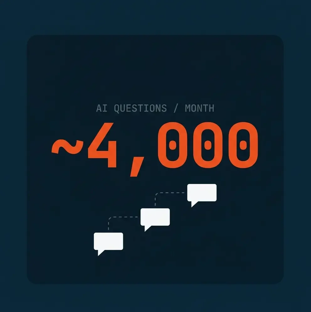
- The chatbot answers around 4,000 community questions a month, and became the second most visited page on cjp.org within days of launch
Built an Analytics Ecosystem Most Federations Don't Have
We unified email, social, search, paid, campaigns, and donations into one dashboard any CJP staff member can use to answer their own questions.
- We rebuilt the analytics foundation from scratch, with donation events, scroll tracking, and campaign attribution in place from day one
- We set up a BigQuery data warehouse that CJP owns outright, pulling email, social, paid, and donation data in daily, at a fraction of what connector subscriptions cost
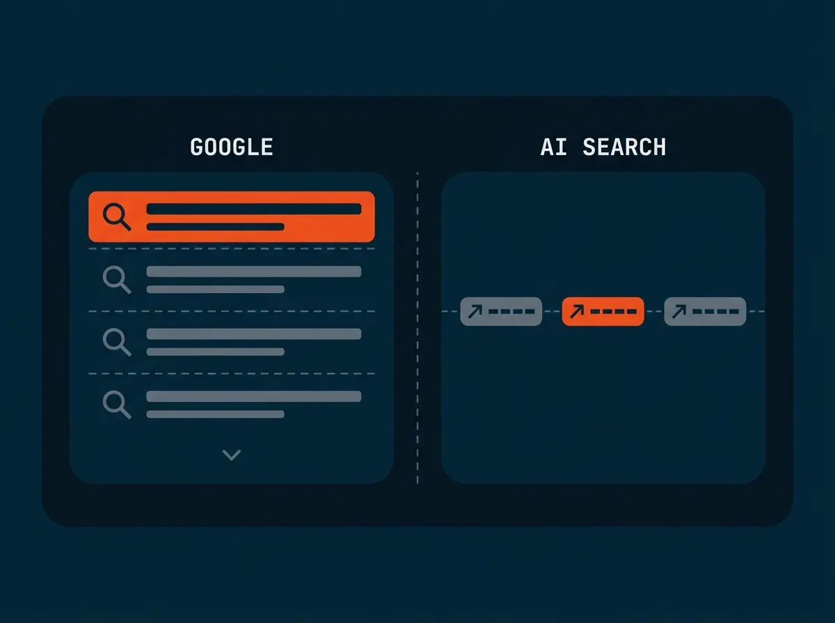
- We built a single dashboard with 11 views, from the executive overview down to share of voice across Massachusetts, including how often AI search results mention CJP versus its peers
- We put tracking rules in place for every campaign, with short URLs and QR codes, so even a link read out loud at a gala still gets counted
Made CJP Findable, in Google and in AI Search
We built a multi-year SEO strategy focused on local search, because CJP serves the Greater Boston community, optimized the entire site around it, and continue to run SEO for CJP today.
- We gave every page a primary and secondary keyword, including Hebrew terms (chesed, simcha, kehillah) that no other organization ranks for
- We rewrote meta titles and descriptions across the site and set alt text standards for accessibility and search
- We crawled all 372 URLs two weeks after launch and ranked every fix by how much it was costing in search visibility
- We keep optimizing after launch: ongoing audits across the entire site ensure every page strengthens the others, so CJP's search authority improves month after month
- We built a multi-year SEO strategy focused on local search, because CJP serves the Greater Boston community, optimized the entire site around it, and continue to run SEO for CJP today.
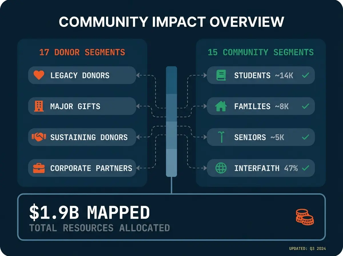
Mapped the Community: 32 Research-Backed Personas
We mapped the entire Greater Boston Jewish community, including donors, individuals, families, and organizations, into 32 personas, each grounded in real population data and giving capacity.
- We built 17 donor personas, from legacy donors with $500K to $1M giving capacity down to next-generation wealth holders in the 30-to-45 gap that was hurting retention
- We created 15 community personas spanning families in crisis, students, interfaith families (47% of households), seniors (45,000+), and six types of Jewish organizations
- We quantified every segment using Community Study data, Pew Research, and CJP internal records: 14,000 students, 2,500 to 4,000 DAF holders, 15,000 to 20,000 Russian-speaking community members
- The personas now shape CJP's site architecture, content priorities, and donor campaigns
Audited the $1.9 Billion Donation Ecosystem
We traced CJP’s donation infrastructure end to end, across 6 giving pathways, 7 platforms, and 12 forms, to find exactly where donors were giving up.
- We mapped every pathway: one-time gifts, recurring gifts, donor-advised funds, endowments, grants and scholarships, and the $59M Israel Emergency Fund
- We identified PDF-based forms as the main reason donors quit mid-gift and benchmarked CJP against UJA-Federation of New York and peer federations
- We designed a phased Salesforce migration with one donor database, web forms replacing every PDF, and modeled targets of 30% better retention and 25% more repeat gifts
- We wired donation events into the dashboard, so when a form changes, CJP sees the effect the same week
Every Recommendation Comes With a Result
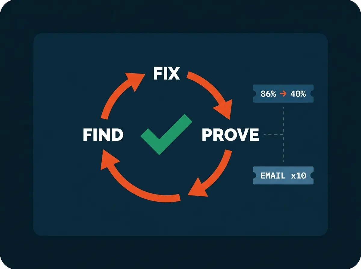
We don’t hand CJP reports and walk away. Every recommendation we make gets implemented, measured, and reported back, so leadership always knows what worked.
- We use the analytics we built to find where the community gets stuck, then redesign those moments instead of guessing
- When the data showed visitors were missing the study's reports, we restructured the page experience, and the share of visitors abandoning before the first call to action fell from 86% to about 40%
- When the data showed email was CJP's most powerful dormant channel, we helped reactivate it, and email engagement grew nearly tenfold in a single month
- Every change comes with a before-and-after number, which is how CJP's team builds the case for digital investment internally
What we Achieved

The new cjp.org went live and the community showed up: traffic up 52% over the prior year, visitors staying 2.5x longer (1:32 to 3:45), 50% more pages per visit, and mobile visits more than doubled in length. Homepage engagement rose from about half of visits to nearly seven in ten. People aren’t just arriving. They’re reading the stories, exploring the impact pages, and finding ways to get involved.
The number that can’t be dismissed as a launch bump. Organic search traffic to cjp.org is up 85% year over year, with non-branded keywords doing the growing. On the study site, organic sessions compounded 4.4x in three months with zero paid spend. New donors, new families, and new volunteers now find CJP without CJP paying for the introduction.
The Data Navigator turned a once-a-decade study into a conversation. The chatbot answers around 4,000 community questions a month, 15.3% of all visitors used it in its first week, and usage was still doubling a month after launch. Every answer comes strictly from the study data, nothing improvised. No Jewish federation had put a tool like this in front of its community before.
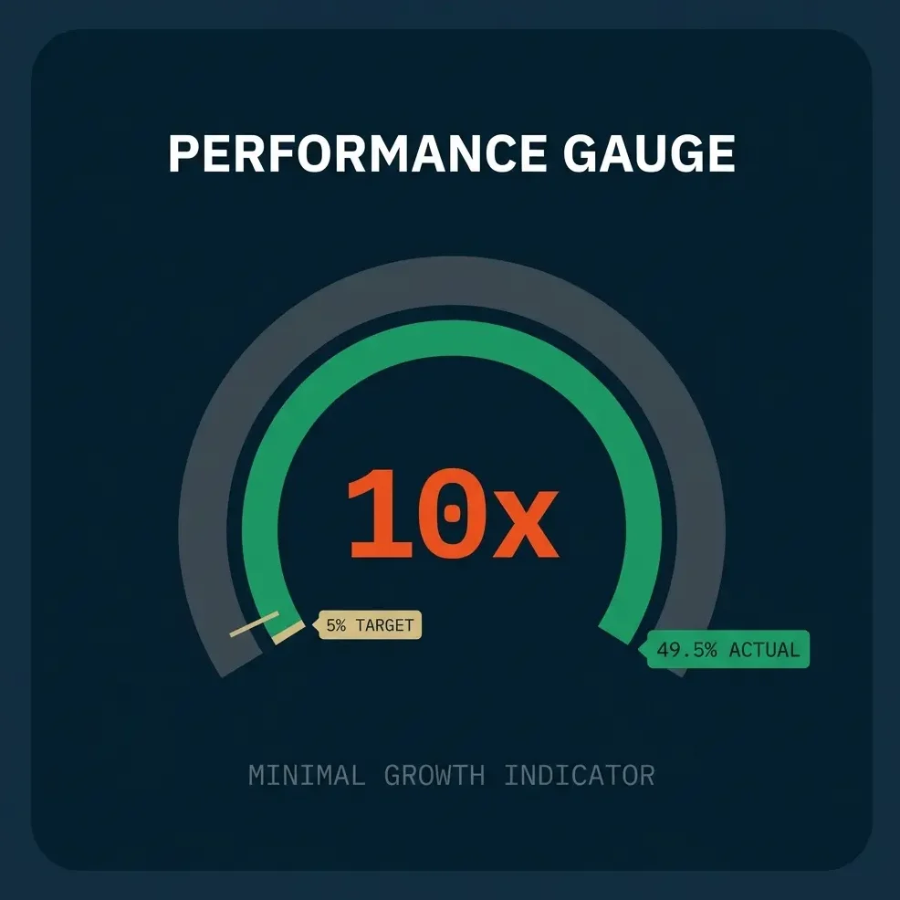
CJP set a 5% download target. The study site converted 67.1% of visitors on launch day, held 49.5% through month one, and has delivered 4,300+ downloads from 8,000+ visitors across all 15 reports. The biggest later gains came from reports people rarely found on their own (Ages +150%, Diversity +143%, Families +121%). That’s what happens when an AI assistant helps a community discover its own research.
Most federations answer “which email drove the most engagement last quarter” with a week of manual pulls across disconnected tools. CJP answers it in one click. Email, social, search, paid, campaigns, events, and donations in a single dashboard, on a data warehouse CJP owns, with 100% campaign attribution (up from 23.6%) and share of voice tracked across Massachusetts, including how often AI search engines cite CJP versus its peers. The marketing team stopped being a reporting bottleneck and went back to marketing.