
9 Vital Healthcare Website Design Tips for 2024
If the healthcare industry really needed another wake-up call to get its digital house in order, boy did 2024 deliver and then some.
COVID-19 is more than any of us ever bargained for, but can you imagine a more important time for healthcare entities to focus on creating a robust and user-friendly web experience? “Non-essential” clinic visits (which were largely interpreted to read “non-coronavirus”) were suspended for weeks on end in many jurisdictions.
The clinic waiting room felt like a dinosaur anyway. The clipboards and 45-minute waits were bad enough. Now, with a highly communicable virus running roughshod through the population, no one wants to be filling out that clipboard for 45 minutes in a crowded waiting room full of coughing strangers. Or waiting in line at the pharmacy with a coughing stranger behind them.
From telehealth remote consults, to mail-order prescriptions, to mail-in COVID-19 testing kits, to reliable self-diagnostic information, consumers want (and often need) to rely on the internet for their healthcare needs, just as they do to get groceries delivered or watch in-theater movies on demand.
In a post-COVID world, healthcare providers that used to rely on being a patient’s only option will live and die on a hill that companies in other industries have been dying on for over a decade—their website, specifically the user’s experience (UX) of that website.
Even though it should be easy, website design for healthcare companies is difficult.
There is a complete disconnect between what healthcare organizations want when it comes down to healthcare website design strategies & implementation and what users expect to see when looking at the websites.
Watch this video to learn how Digital Authority Partners designs software that works for your business!
Not convinced that bad design is a problem for customers dealing with healthcare websites? Consider these three facts:
- 95% of healthcare marketing executives believed their company’s website was the primary driver of new business for hospitals in 2017
- 52% of consumers search medical providers online before engaging with hospitals
- 81% of consumers are unhappy with their healthcare experience
Whereas digital platforms are finally a focus for healthcare executives, patients aren’t that satisfied with what they’re getting.
The average healthcare organization is struggling to create compelling user experiences. They are also grappling with how to craft beautiful and usable designs that delight and amaze their users.
User-centric healthcare website design focuses on web design techniques meant to deliver an enhanced user experience to users looking for healthcare products or services. An effective healthcare website design strategy incorporates mobile responsiveness, marketing goals, and complies with ADA regulations.
In this article, we will quickly review the top nine web design principles every healthcare company should be watching in 2024 (and implement it religiously with any new website redesign).
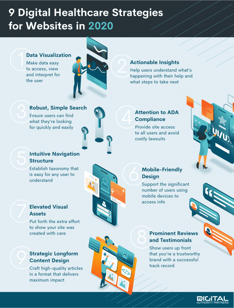
1. Invest In Data Visualization To Help Patients Make Sense Of Their Health
Data visualization is a concept many organizations in healthcare and elsewhere have started adopting. Traditionally known in the context of business intelligence tools, data visualization has started making its way into the consumer space.
In the healthcare space, the concept is simple: show users complex information in easily digestible ways that they can quickly make sense of it without assistance.
The internet has accustomed users to have point-and-click access to all sorts of data, from their history of bank transactions to their daily iPhone usage to their record of Amazon orders. Healthcare providers who think that users will wait for a phone call or snail mail do so at their peril.
In the design space, of course, the poster-boy of phenomenal data visualization is the online Fitbit dashboard.
Fitbit was a pioneer in leveraging best-in-class design principles to create an interconnected experience between a physical device, a mobile app and their online dashboard. This was even more remarkable because it came from a health manufacturer, hardly the source one would expect for great designs.
From a pure data visualization perspective, nobody got it better than Fitbit. Many other vendors simply emulated the same overall display language and dashboard structure.
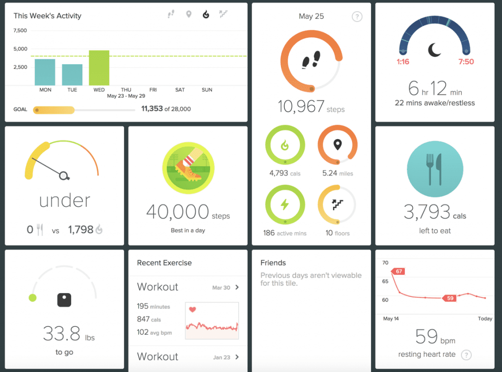
What makes Fitbit so amazing is that, as a user, you understand exactly how well or poorly you are doing from a fitness perspective in 30 seconds or less. Through a combination of iconography, warm color palette, and explanatory text, their simple and intuitive designs require no additional explanation of any kind. It simply provides a wide variety of metrics that track your performance against your daily health goals.
Another remarkable function Fitbit enabled on their digital dashboard is the ability to “drag and drop” various modules on the page. For example, if I’m most concerned about my steps, water intake and sleep quality, I can move those modules to the top of the dashboard.
Fitibit’s digital strategy is simple: make people care about their health. Encourage them to be active. And show them the progress they’re making against the goals they’ve set up.
This is accomplished within a beautifully-built, intuitive design that uses simple data visualization to help users reach their health goals.

2. Provide Actionable Insights Patients Can Clearly Understand
Have you ever been to a doctor and thought the medical staff were speaking a completely different language? Although you knew they were speaking English, the words seemed to be playing a trick on your mind and you couldn’t really understand what was being said.
Healthcare professionals use industry jargon that only makes sense to those with near daily exposure to these acronyms and technical terms. A recent study showed that medical jargon and lack of specific recommendations is clouding doctor patient communication.
The same argument can be expanded to the healthcare industry as a whole. Healthcare has only recently begun to become patient-centric. Such patient inclusion is still rare in many medical offices.
Becoming patient-centric requires a shift in the mental paradigm. Healthcare website design should include designing for emotion. This requires understanding –– and embracing –– the fact that patients do not have the same knowledge as medical professionals. Your digital interface needs to recognize this and be laid out so that it is very easy for digital users to understand what they are seeing.
Useful, actionable content builds brand trust. Experts (including doctors) used to hoard their knowledge for fear of being replaced. The internet has actually proven that the opposite is true. If knowledge is power, consumers reward those that empower them with brand loyalty, coming back, again and again, to learn more and more, eventually converting to buyers.
This is especially the case for healthcare providers. Patients can learn everything there is to know about blood work, but they can’t analyze their own blood sample
Let’s take a look at a famous DNA testing and analysis dashboard.
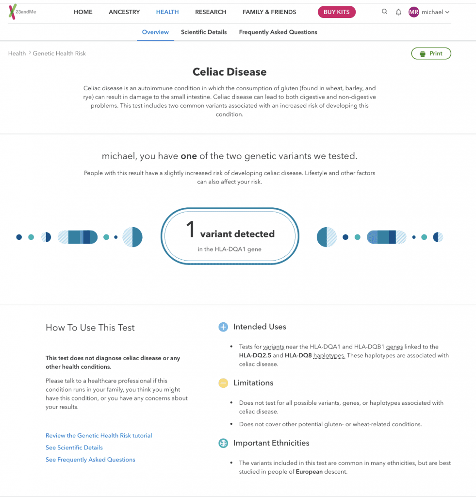
23andMe is dealing with very complex hereditary predispositions to specific diseases. In the above example, the user is predisposed to Celiac Disease. On the details page, 23andMe does an excellent job of “translating” this concept to the end-user:
- It explains what the disease is
- It tells the user whether he/she is predisposed to it
- It recommends that the user to get in touch with a healthcare professional
- It clearly calls out this isn’t a diagnostic
- It highlights the intended use of the report and its limitations
All in all, this type of visual design and information architecture is everything a great healthcare website should be. It’s simple, in plain English, with clear visual elements and detailed explanations.

3. Make Search Functionality Robust But Simple
Google makes it look easy. You type in one or two keywords, and you get the website you were looking for. Right?
In fact, search is an early marvel of a kind of artificial intelligence that is anything but simple. Web robots have to interpret the input, then search the defined ecosystem—in the case of Google, the entire public-facing internet—for not only the most relevant but also the most authoritative content.
Schedule Your Free Consultation
Looking To Meet Now? Schedule A Meeting Today
Website search functions are kind of like mini-Google, allowing a user to search only the website ecosystem. And yet, so many websites get it wrong. Overly simple or uncalibrated search systems return useless or irrelevant information to the user, without any recourse to refine the search other than trial-and-error.
A website will lose users if they can’t find what they are looking for within the website, quickly and easily. A website where users can easily find what they are looking for will win a permanent place in the user’s browser history.
So what goes into a patient-centric site search function that users will actually find helpful?
- A search button or field that is clearly and prominently displayed on every page, so you don’t have to go searching for the search. Extra points if the search box populates suggestions as the user begins typing.
- Categories that search results can be grouped into—for example, “Neurology,” “Oncology,” “Psychiatry,” “Epidemiology,” “Addiction,” and any subcategory that might fit under each of those categories.
- Filters, which allow the user to narrow the search down even after they have executed the search. For example, checkboxes that allow you to narrow the search to “Providers,” “News,” “Locations,” etc.
- Sort functions. Users often want the most “relevant” result, but sometimes they might want the most recent result, or, in the case of a healthcare eCommerce site, the lowest-price or best-reviewed result.
- A “Breadcrumb Trail.” This is a listing of every super-category that the search term is nested in that sometimes appears beside the number of results—for example, “Cardiovascular > Heart Disease > Diabetes > Type II Diabetes > Risk Factors.”
- Search terms highlighted within the results.
- Introductory text—not just the title of the result, but an excerpt from the result that includes the search terms.
On the back end, a good search function will allow you to check the search logs to discover popular search terms, indicating possible directions for a future content campaign.
Let’s look at an excellent example of robust, simple search function in a healthcare website:

See how there’s a boldly-colored button marked “Search” with a magnifying glass icon, prominently placed in the upper-right corner of Indiana University Health’s search results page? That’s not an accident. That icon is there on every page, including the home page and every sub-page, beckoning the user like a dare to cut to the chase.
For users who do, they are rewarded—clicking the red “Search” button pops up a large search dialogue box prominently in the middle of the page, right where you see it. When you type a search term like “Oncology” into the box, more targeted suggestions populate in a drop-down suggestion window— “Interventional Oncology,” “Urology,” “Radiology & Imaging,” etc.
Once you execute the search, either by hitting “enter” or point-and-clicking another magnifying glass icon on the right-hand side of the search dialogue box, the site delivers two categories of results—“Site Results” in the middle for users looking for information; and to the right, “Provider Results,”that is, doctors and personnel, for users in search of a healthcare provider to consult. The site results highlight the searched keyword in the site result title and a content preview so you can gauge the relevance of the result by the context of the keyword.
The top of the search box helpfully declares both the total number of results, as well as the shown results—site results are limited to ten per page, provider results to three per page, so you don’t get too much information at once.
The cherry on top is the checkbox-activated sort-filter options in the column to the left, where you have the option to filter the results down to “Medical Services,” “News,” “Providers,” etc.

4. Pay Attention To ADA Compliance
The Americans With Disabilities Act (ADA) is a comprehensive civil rights law that protects individuals with disabilities from discrimination. Since its inception, ADA guidelines applied almost exclusively to rules and regulations regarding public access to buildings, public areas, public transit, etc.
In 2010, the ADA issued a series of rules and regulations about website accessibility. In doing so, it opened the gates for lawsuits from both individuals and companies representing individuals who cannot process the information on a website due to failure to create user experiences that live up to minimum standards of accessibility.
You would think that healthcare companies would have learned over the last eight years how to become ADA compliant. Unfortunately, that would be an incorrect assumption.
In 2017, there were at least 814 documented lawsuits against companies for breaching Title III of the ADA (Website Accessibility Act) that included a variety of putative damage lawsuits.
One of the more famous lawsuits in the healthcare field involved Tenet Healthcare which operates various websites in Florida. The case was eventually dismissed but the company made dramatic changes to their website to become compliant.
So how does the ADA apply to healthcare website design?
It’s simple. The ADA uses the Web Content Accessibility Guidelines to determine whether a site is compliant. These guidelines have very specific recommendations for various aspects affecting the user experience of a digital property. In addition, in early 2018 the 508 standards for website compliance were instituted.
Both sets of rules have much in common. They boil down to these points. Any website that is accessible to the public should be:
- Perceivable
- Operable
- Understandable
- Robust
To measure how a website fares against these standards, the ADA has provided more than 100 guidelines for healthcare companies and agencies in this space. These guidelines affect anything-from typography, font, colors, animation, video production (example videos on a site should have subtitles: University of Berkley was sued over this in 2016) and more.
Designers of ADA-compliant websites succeed when they put themselves in the shoes of three classes of disability in particular:
- Visually-Impaired. Web browsing was designed as a visual medium, so the visually-impaired face extra challenges in taking advantage of web-based services. If fonts are not large enough or the colors contrasting enough, they may not be able to read text.
Legally blind persons often make use of a screen reader, which interprets data on the screen and reads it aloud with a synthetic voice. Of course, the screen reader cannot see and describe images … but it can read image metatext, meaning ADA-compliant websites must have descriptive alt text in their image code. Improperly-nested HTML markup and non-descriptive links can also make a website hard to comprehend or navigate for users of screen readers.
- Hearing-Impaired. With video content one of the fastest-growing segments of the web, the hearing-impaired get left out in the cold if content creators don’t scrupulously subtitle their video content with closed captions.
- Motor-Impaired. People without motor disorders take for granted the advantage of a mouse or trackpad, which makes “point-and-click” functions of a website easily accessible. If a person’s impaired motor function precludes the use of a mouse or trackpad, (s)he must depend entirely on a keyboard. ADA-compliant websites must be navigable by keyboard shortcuts and commands only.
In general, Digital Authority Partners follows all ADA (WBA) rules in its website design, without concern for whether the client falls under the ADA prerogative. Being ADA compliant, from a design perspective, shouldn’t be done just because it is the law. It should be done because it’s the right thing to do.
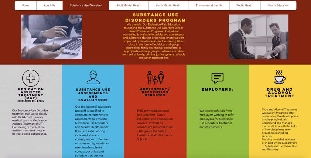
So how does a website that may not be ADA compliant look? Check the designs below from an Illinois hospital.
We can write an entire article fully dedicated to how this state hospital website is probably not ADA compliant. That would require analyzing each page and highlighting different parts of the ADA guidelines which may be breached.
In simple terms – just look at the section in the middle above. Bright red with dark black content. That content isn’t easily legible. Even as an able-bodied person, I’m having trouble reading the text given the color scheme used.
If I’m having trouble, imagine the difficulties of those who are color-blind and who will already interpret the red/blue/yellow above as grey. They would have a very hard time seeing grey on black.
Also, the website font size is abysmal. Even with normal vision, one needs to use the browser zoom function to read the information on the page.
Lastly, the team who built this website did a very poor job with the mobile responsive implementation. When accessing this site on a mobile device, reading the text in its entirety is impossible because the text cuts off on a phone as seen below:

This is just one example which stands out not only because of the horrendous color choice used to build a healthcare website, but also because this healthcare company chose uninspired fonts, typography, and font sizes that are friendly to hardly anyone, certainly not those who are protected by the ADA.
5. Have An Intuitive Navigation Structure
Any healthcare website should spend considerable time creating a simple and intuitive site taxonomy. Also known as the navigational structure, a website taxonomy is the way you organize your entire site so that it makes intuitive sense when users navigate from one page to another.
It’s simple in principle: organize your entire site in such a way that any user can quickly understand how your site is structured. That way, users can find the information they’re looking for quickly and effectively and without seeking assistance from other people.
There are many websites with a phenomenal taxonomy, and even more that have a decent one. However, there are also healthcare sites with taxonomies that don’t make the slightest sense to anyone outside of the IT department that built that website.
Here’s an example:
As I said above, the operative rule in healthcare website design (or any website) is to have a persistent, intuitive and logical organization of information on your site so that a user always knows where they are within the website and how to access other pieces of information there.
That sounds simple – but sometimes it’s not.
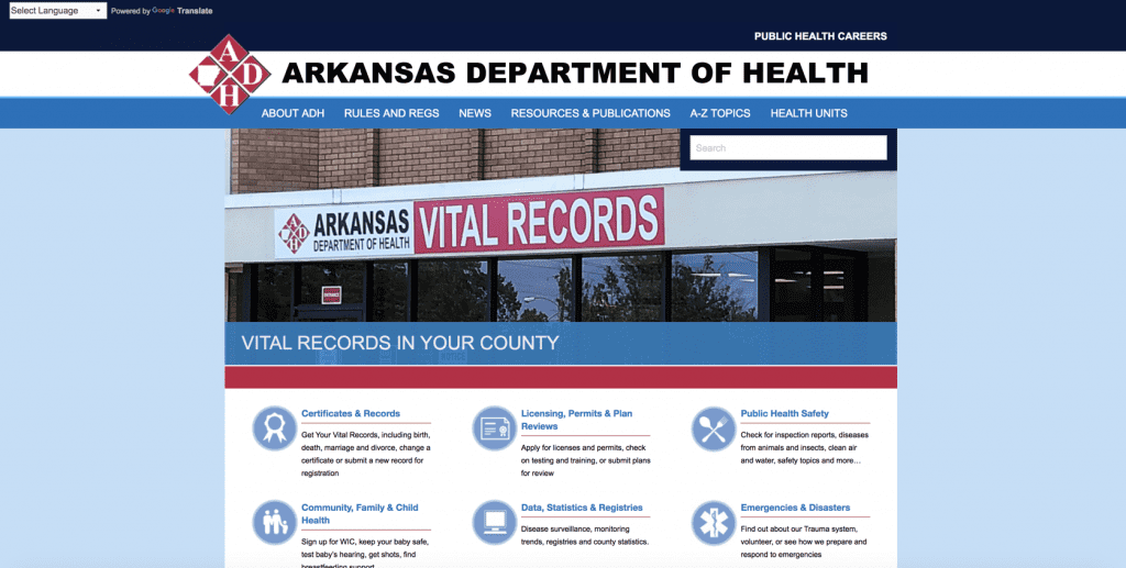
As can be clearly seen in the Department of Health example shown above, having a great navigational structure is not as simple to achieve as one would first think.
Why is this navigational structure so poor? Let’s take the page apart and do a brief analysis of the sections.
About ADH: this section should only include “about the department information.” Unfortunately, this section also includes legal documentation (like HIPAA regulations), consumer reports and “state of affairs” pages about how well healthcare coverage and service are going in the good state of Arkansas. In other words, the “About ADH” section is mish-mash of information types that do not logically fit with what a user would ever want to read when clicking on the ‘About” section.
Rules and Regs: this section also is more than expected. It contains information about emergency rules in Arkansas, but it also lists upcoming law amendments, legislation currently being considered on the Arkansas senate floor and more. With such a name, these are not items you would expect to see in this section.
A-Z topics: this is nothing more than a sitemap. This year, most websites stopped showing any site map. Oddly, for this organization, an antiquated sitemap is given primary real-estate in the global header. It is also entirely misnamed, to boot.
Health units: This is a term few would intuitively understand. This section provides the locations of all hospitals and clinics in the state of Arkansas.
A site structure is supposed to be simple, intuitive, and clear. That is the core element of any minimally effective healthcare website design. At base, it is supposed to be transparent in the organization and labeling of its information, as well as comprehensible without any further explanation.
Without a clear navigational path and organizational structure, your online visitors won’t find what they’re looking for and will abandon your site. To capture and retain them you should make these 2 elements one of your top 5 priorities when redoing your healthcare website design.
6. Remember To Make It Mobile-friendly
For most of us in the digital strategy and design space, not having a mobile friendly website is preposterous. The vast majority of companies have built or redesigned their websites with one simple fact in mind: more than 50% of all web browsing in the world occurs on mobile devices as of 2018 (to be exact, 52%).
Unfortunately, the healthcare industry is not progressing as quickly in this direction as we would have hoped.
Look at the example below of two healthcare institutions in Chicago. The one on the left is mobile friendly, the one on the right is not.
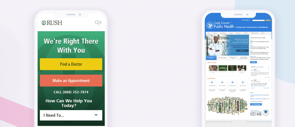
The importance of a healthcare website design that is mobile-responsive cannot be overstated.
First, it has been long established that Google de-prioritizes websites that are not mobile friendly in their ranking of search results. If your website isn’t mobile responsive, you might as well not exist unless a customer types in a specific branded term (for ex., the name of your company). For any other terms for which you may want to rank, you can kiss Google traffic goodbye.
Second, with smartphone access comprising more than 50% of traffic, you really want to make sure you provide these users with a great digital experience. After all, they’re coming to your site seeking information; if they can’t easily read the text on the screen, then you failed at your job as a healthcare organization.
Third, stay ahead of the competition. As you read this article, you may be thinking about this or that competitor without a mobile-responsive website. That may be true, but that’s not the point. Be the change you want to see in this world. Customers will reward you. Even if most of your competitors don’t have mobile-responsive websites, that doesn’t mean you shouldn’t. Getting a mobile responsive site is both affordable and, for many, expected in 2023. So do it and beat your competition with a healthcare website design that is impressive in its simplicity and elegance while conveying the answers to questions patients ask.
7. Elevate Your Visual Assets
Again, web browsing is first-and-foremost a visual medium. Healthcare websites that don’t leverage a strong visual component—vibrant imagery, animation, and video content—are selling themselves short.
According to a famous study by the Missouri University of Science and Technology, it takes visitors two tenths of a second to form an opinion about your brand based on what appears in their web browser. Even the fastest speed-readers couldn’t take in your astute written healthcare content that quickly. It’s all about the visuals. Patient-centric websites leverage this tendency, rather than cater to non-existent tendencies we might wish patients responded to.
Many principles go into maximizing the visual impact of your site:
- High-end photography and videography—cheap stock photography just doesn’t get it done.
- Visual balance—no one element pulling too much focus or causing extreme asymmetry.
- Compartmentalized design that uses grid layouts and the Rule of Thirds. Rules were made to be broken, they say, but no one wants to imagine their surgeon going off-book and improvising. A conservative, reliable grid design is usually the way to go in healthcare web design.
- A limited color palette, not a rainbow circus. The classic colors for healthcare websites are soothing light blues and greens, aquatic colors that evoke health and wellbeing.
- Graphics that go together—no flat graphics next to small-aperture portrait photography.
- White space—empty places in the design that give the eye a rest and prevent the site from becoming too busy.
- “Micro-interactions”—small page animations that bring the site to life, like images that change color and reveal legends when you hover over them, or images with light parallax effects. Just don’t go overboard and make the site a circus.
Let’s take a look at a healthcare website that makes the most of its visual impact:
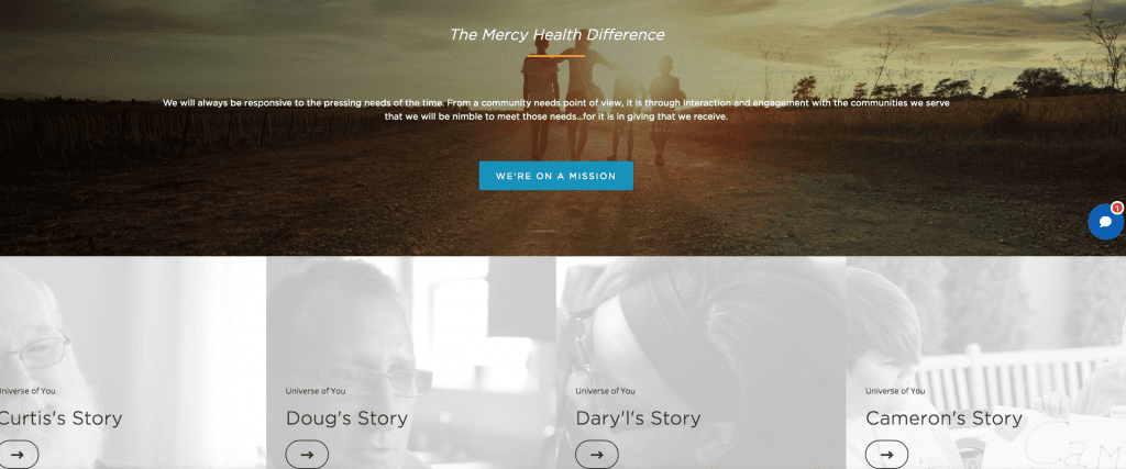
Mercy Health uses high-quality, vibrant photography throughout, with prominent use of soothing green. As you scroll down, you discover white space, as well as faded imagery which does the job of white space … but then hover over the faded images and discover animated “micro-interactions,” directing you to “stories” from patients to create personal engagement.
8. Have A Design Strategy Around Longform Content
Healthcare isn’t well served by sound bites. If it were, medical school wouldn’t last four years and deforest whole states to make the textbooks.
A whopping 80% of American internet users searched for healthcare-related content online according to a 2019 study. Healthcare providers understandably want to fulfill that need and afford themselves the benefit of an educated consumer base. As mentioned in #2, robust, actionable content is a hallmark of a patient-centric website.
What to do when that content runs long, though? A massive block of text can easily scare away a reader looking for a quick hit.
Engaging long-form content structured properly, however, can hook the reader and keep them for the long haul. Not only do they gain value and associate your healthcare brand with that value, but their attention improves SEO metrics like time-on-page and bounce-back rate.
So how do you structure long-form content to hook readers rather than scare them off?
- Invest in quality. Recruit or hire content writers who can start an article off with a bang. A magnetic lead builds investment in readers for the long-haul. Make sure the article is light on impenetrable jargon that only a doctor will understand.
- Give the content space. Give the text blocks wide margins, with significant space between the lines and even between the letters, so that only so many words appear on the page at a time. Break up large paragraphs into small paragraphs. Don’t intimidate the reader with the prospect of a long read; entice them with a short one.
- Break the content up into subtopics. Each sub-header should encapsulate a complete thought, which benefits from but stands alone from the context of the larger piece.
- Strategically place images. Avoid text wraps—that just draws attention to the length of the piece. A popular image cycle can be repeated throughout the piece to continually renew and refresh the user’s interest:
a. Large Hero Image
b. Intro Text
c. Large Image
d. Subheader or Big Text
e. Body Text
f. Back to Large Image and Repeat.
imaware does an amazing job with its long-form content, which is critical for their business model—eCommerce sales of mail-in home-based health screening tests for conditions ranging from prediabetes to COVID-19.
Check out the imaware informational blog on COVID-19, a topic on many searchers’ minds:
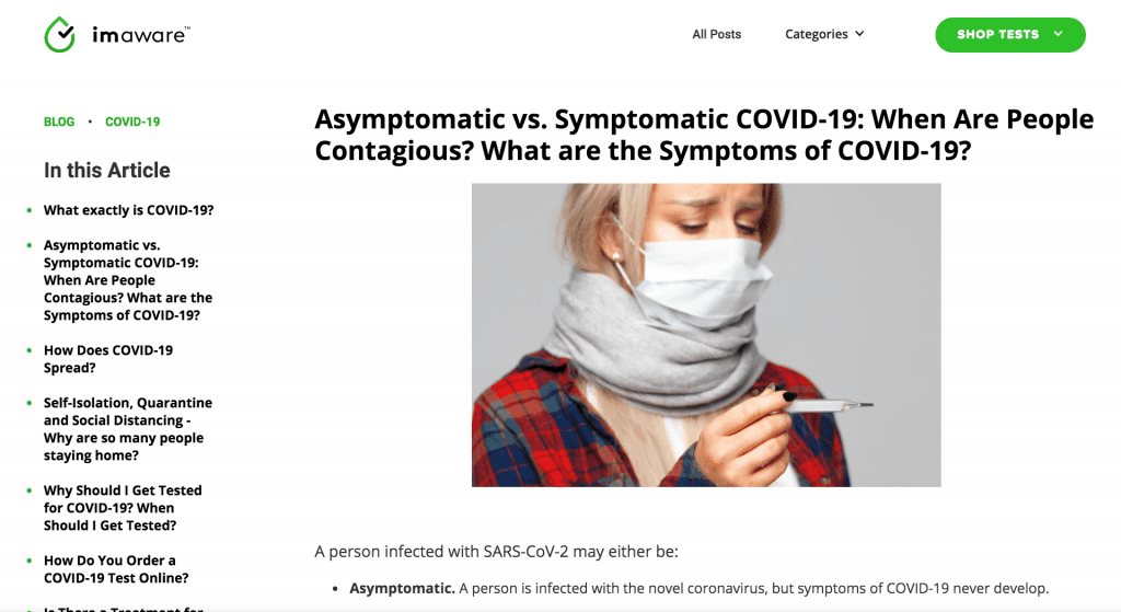
This blog is over 3,500 words long—more than triple the length of even a long-ish blog. But you wouldn’t know it from any individual screen grab. The line and character spacing are generous, and the large blocks of text are broken up by headlines, small paragraphs, and bullet points to make it scannable.
Sources are linked right in the text, not at the end. Each subheader is a self-contained unit, almost like an FAQ, the sections building on each other but not dependent on each other, to create a unified whole.
By the way, this article is over 5,000 words long, and you’re nearly done!
9. Make Reviews And Testimonials Prominent
Testimonials are a key factor in online decisions. Testimonials and reviews, even by people they didn’t know, influenced the online purchasing decisions of 70% of all respondents of a Nielsen survey, second only to recommendations from friends and family members.
If a healthcare company is fortunate enough to have effusive reviews of past customers in their pocket, that is a significant asset. What a shame to bury it in a hard-to-find subpage. Yet that is exactly what many healthcare websites do. They frontload imagery and informative content. These assets influence purchasing behavior … but not as much as testimonials.
Potential patients want to know what other patients are saying about you. A patient-centric website will put those “What Our Users Are Saying” tidbits front-and-center.
How can you prominently display testimonials as a healthcare entity? Arkansas Surgical Hospital sets a great example:
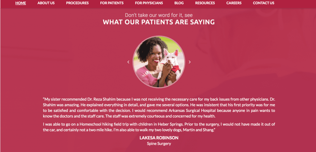
This testimonial pane isn’t right at the top of the browser page, but it’s no more than three page lengths down and highlighted in bold colors, with ample “empty” space to draw attention to the embedded content.
The scrolling testimonial viewer allows the user to look at one testimonial at a time in manageable chunks, while other testimonials are easily available only a click away. Not only can visitors scroll through user testimonials, but they can also see pictures of the reviewers, making a personal connection with the happy customer’s smiling face (and cute dog).
We Can Help With Your Healthcare Website Design
In the shadow of the pandemic, creating an engaging experience for your healthcare website design is more critical than ever. Health and medicine are on everyone’s mind, and consumers expect the same level of digital proficiency from their hospital or healthcare service provider in 2024 as they do from the other digital platforms they’re interacting with online. Healthcare providers need to up their digital game as if lives depended on it.
In this article, we covered the top nine healthcare website design principles that make or break an industry website. These include:
Data visualization: the ability to help users access and visually interpret their own medical data online without help from their physicians or other medical personnel.
Actionable insights: the ability of users to understand exactly what’s happening with their health and what to do next about it.
Search functionality: robust, easy-to-find search tools, with categories and filter functions to help users easily find what they are looking for.
ADA compliance: the ability of users with disabilities to easily access your healthcare platform.
Easy navigation structure: the ability of users to make sense of your website without assistance from a third party.
Mobile responsible designs: the ability of users to access information about healthcare providers on their mobile device.
Elevated visual assets: engaging visitors quickly with a site that is easy on the eyes.
Strategic designs for long-form content: cultivating trust and an educated customer base, not scaring users away with huge blocks of text.
Prominent placement of testimonials and reviews: making it easy for potential patients to trust you by making rave reviews easy to find.
Ultimately, the highest good of healthcare is care of patients. As healthcare providers learn to treat their websites not as curiosities but as centerpieces for their mission and heart valves of their care model, they will discover the power of the internet to deliver better, more efficient care, through the pandemic and beyond.
Do you need guidance with your digital transformation initiatives? Digital Authority Partners has worked with companies like Athena Health, Omron Healthcare and Blue Cross Blue Shield on cutting-edge digital initiatives that improve patient outcomes and quality of care. Contact Digital Authority Partners at [email protected] or 312-820-9893.
You may also be interested in reading our in-depth Healthcare industry reports:
- Blockchain in Healthcare: An Executive’s Guide
- Artificial Intelligence in Healthcare: 27 Companies Leveraging AI to Improve Health Outcomes
- Artificial Intelligence & the Pharma Industry: What’s Next
- Big Data in Healthcare: All You Need to Know
- 5 Tips for Healthcare Website Design Initiatives
- 9 Cardiovascular Health Technologies Doctors Should Know
- Alexa in Healthcare: 17 Real Use Cases You Should Know About
Want To Meet Our Expert Team?
Book a meeting directly here


