PPC Ad Examples That Made a Killing | Digital Authority Partners
PPC is often a straightforward, heavily metric-based activity. Unlike content marketing or even classical advertising, there is a general sense that pay-per-click is not the place for creativity, fun, or particularly innovative thinking.
However, as any high-quality PPC agency will tell you, that does not have to be the case. Yes, there is something to be said for the data-driven approach — simplicity is effective, and your targeted traffic is likely to be fairly consistent with the number of click-throughs and conversions that you can achieve. Injecting something a little bit different into your campaigns can turn that consistent flow into a runaway success and generate some genuine industry buzz around your products and services.
Over the last year, there were several examples of PPC campaigns that broke the mold using different techniques. Here are some of our favorite PPC ad examples from 2022 that made an absolute killing, separated into the types of approaches that made them stand out.
If you want to learn how Digital Authority Partners can increase your PPC effectiveness, watch this video!
PPC Ads Examples That Keep It Simple

1. Instapage
Similar in content to the Mailchimp adverts, Instapage essentially boiled their business down to a handful of words: ‘The World’s Most Powerful Landing Page Builder.’ With these ads, the imagery and color scheme do not stand out as much as they could, but they are simple, clean, and to the point, which is what the majority of their target audience would presumably strive for in the landing pages that they would buy from the company.
Schedule Your Free Consultation
Looking To Meet Now? Schedule A Meeting Today
The real stand-out of this advert is in the call to action. Rather than the usual ‘learn more’ or ‘sign up’, they have ‘See Why.’ Combined with the punchy ad content, the CTA really works to bring visitors in.
2. Amazon
Another internet behemoth, Amazon, also knows how to get the all-important click. Their ads are simple and to the point — in fact, they do not even bother telling you what the product is or does in most cases. Take, for example, the Audible banner advert in 2021. It simply had the Audible logo and the words ‘save 66% on your first three months’ with the call to action ‘Get This Deal.’ The company is relying on the fact that the people that see this advert already know what Audible is, so they do not waste any time in re-explaining. Instead, we get the nature of the deal and a button to click to claim that deal.
It is worth pointing out the color scheme here again. The Audible advert in particular uses a block of pastel coloring that is gentle enough to be easy on the eye and comforting, but still stands out from the plain white page that most people will be seeing it on.
3. Allbirds
For an example of how less can be more when it comes to digital advertising, look no further than the Allbirds 2021 PPC campaign. An image of the product in use, the name of the company, the words ‘slip ‘em on, move along,’ and a call to action. Those four elements are all this advert needs to get the message across, and it really works. The use of a more colloquial version of ‘them’ is particularly nice — it adds to the brevity of the piece while also speaking to the audience in a more casual way, almost like you might speak with a friend.
4. Invisalign
We see even more simplicity from Invisalign’s 2021 banner advertisement — just six words and an image. The ad has a picture of the Invisalign product, demonstrating the stand-out feature (the transparency), the name of the company, and the slogan ‘made to move.’ The call to action is really, really good here: a clickable button that reads ‘smile assessment’ with an arrow. Nobody really knows what a smile assessment is, and yet the viewer knows that when they click that button, they will be able to see how the product could help them, which is much more resonant than the usual ‘find out more,’ ‘learn more,’ or ‘contact us.’
5. Samsung
The Samsung Galaxy advert perfectly combines brevity with market awareness: the ad simply states, ‘Create. Work. Anywhere.’ There is not even a particular call to action here — that is how short the advert is — and yet, it is effective. More people than ever before are working and studying remotely or through a hybrid arrangement, and this advert directly approaches those people with a solution that they can understand and use.
PPC Ads Examples That Show Data-Driven Can Still Be Exceptional

1. Vera Bradley
A luggage company and the tail end of a global pandemic that saw the vast majority of travel prohibited. It wasn’t exactly the recipe for a stand-out year, but Vera Bradley absolutely nailed their pay-per-click strategy for 2021. Earlier in the pandemic, the company shifted focus to begin providing masks alongside their typical offering of luggage and handbags. The continued use of data-driven PPC to take advantage of searches for face masks led to the company seeing a boost of 80% in return on advertising spend and a 100% increase in non-branded revenue gains.
Impressive work for a company that, on the face of it, should have been struggling more than most.
2. MyFlightSearch
For their 2021 online advertising, MyFlightSearch made use of Google Ad Strength. This meant that they could utilize responsive adverts that customers would genuinely engage with, which resulted in an increase of 14% in conversions (which is what the end result of any good PPC is, after all) and a 15% improvement in the cost per booking.
3. Swoop
This Canada-based airline took advantage of deep keyword analysis to discover which words and phrases were the best performers, and then built their responsive search advertisements around those keywords. That might sound fairly basic — the results were a 71% increase in revenue and a 61% uptick in conversions: impressive by almost any standard and certainly a standout PPC ad example.
4. Hugo Boss
The iconic fashion house used a wealth of data-driven techniques to change up its PPC and digital advertising in 2021, including audience data, smart PPC bid management, and image and advert extensions. The result? 2.5 times the return on advertising spend (ROAS), and a 5% improvement in click-throughs against all mobile traffic.
PPC Ads Examples That Are On Time and On Point

1. The New York Times
One of the joys of PPC (and digital marketing in general) is that when it is managed correctly, the company can really speak to the zeitgeist. In this vein, The New York Times’ standout banner advert for 2021 simply read, ‘This is when journalism matters most,’ expressing the general feeling that the mainstream news media has become too partisan and cannot be trusted to tell both sides of any given story.
By giving added emphasis to journalism rather than news, the NYT sets itself apart and reaffirms that it is a trusted, reliable, and high-quality source for information and opinion.
2. Amazon (again)
The campaign for the main Amazon consumer site is equally good at taking changing trends into consideration. As more and more customers seek to move away from the massive corporations and toward smaller or more local businesses, arguably the world’s largest retailer capitalizes on this movement by stating that you can find small businesses on their platform. This is a great example of digital marketing moving with the trends and reacting more quickly and aggressively than the more traditional marketing avenues.
3. Brita
Another excellent example of responding to real-world concerns and desires with digital advertising, the Brita 2021 display adverts simply state, ‘Great taste, less waste’ with an image of a portable water bottle — the message, of course, being that using the Brita product line will reduce the amount of disposable plastic bottles used. The imagery here also speaks to the convenience of the product, which is one of the chief drivers for individuals to use plastic bottles, so there is a dual approach to getting the message across.
PPC Ads Examples That Compare Apples to Oranges

1. Ridge
The Ridge banner advert in 2021 was not necessarily ground-breaking in its style, but its delivery was perfect. The ad is split into two parts, text and an image, with the text representing the all-important elevator pitch for the product — ‘A slim, RFID-blocking wallet designed to streamline’ — and the image simply showing a classic style wallet next to the Ridge model.
Even if the viewer had never previously considered that they had an issue with their wallet before, this advert will show them that the situation they have right now can be improved, which is halfway to a sale. Sometimes the simplest ideas are the most effective, and this side-by-side comparison is a great example of that.
2. Apple
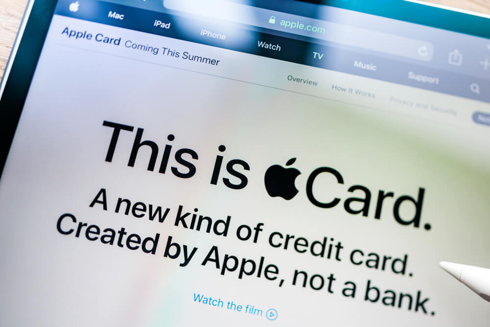
Apple also used the side-by-side comparison in their 2021 banner ad for the Apple credit card. The two halves of the ad in this case, however, use words rather than pictures, but to similarly great effect — one card has no fees and you can apply in minutes, whereas all the other cards have a lot of fees and terms apply. That is all the prospective customer needs to know, and it speaks to the main selling point of the card in a way that the audience can immediately grasp.
PPC Ads Examples With Eye-catching Designs

1. Mailchimp
The Mailchimp banner ads for 2021 were outstanding. Bright, vibrant colors made the banners stand out, and when coupled with the cartoon representation of the company logo, the overall look was equal parts retro and comic-book — both design elements that continue to be super popular.
Furthermore, the message was brief and on-point: ‘create email campaigns that get more clicks’ could not be any more of an elevator pitch for the company, and a simple call to action to finish the ad is all that was needed.
2. Disney+
The Disney+ digital adverts speak to their three core demographics — there is an easily recognizable image from Star Wars, one from the Marvel sequence of films, and one from their more recent animated offerings. This multi-pronged approach is a quick and effective way of demonstrating value to a broad audience. Any given family might have individuals with an interest in at least two of those three offerings, and non-families will more than likely have an interest in at least one.
They accompany those images with a call to action that is a click-through to a free trial (no mention of price anywhere on this ad) and the text that emphasizes Disney’s positioning as a world leader in terms of visual entertainment.
The advert is once again a solid block of color, this time in a bold blue that aligns perfectly with the Disney brand.
Disney+ actually had a range of noteworthy ads last year, including the ones that promoted exclusives. In a world of growing competition for video-on-demand subscription services, exclusivity is the only way to attract consumers — and Disney+ handled this with simplicity. Take ‘The Mandalorian’ ads, for example, an uncrowded image of the titular character, the show logo, and the words ‘Exclusive Original series, streaming now.’ No fluff and no work for the reader to do to interpret the message — if you want to watch this popular show, you need to click here.
PPC Ads Examples That Give the People What They Want

1. Autozone
Any content writer will tell you that the best approach is usually to speak about how your product or service fixes a problem, rather than simply stating what you do. So instead of saying that you sell a drink, you would say that you are in the business of quenching thirst, for example.
Schedule Your Free Consultation
Looking To Meet Now? Schedule A Meeting Today
Autozone hit the nail on the head with their banner ad: an image of a check engine light with accompanying text that simply states, ‘Check engine light on? We can help.’ You know exactly what you are getting here, and there is an immediate emotional connection being built.
Big Brothers Big Sisters
This advert is a perfect example of how to combine text and imagery to build a story. The call to action here is to ‘Start Something’ — the company is looking to recruit individuals to become big brothers and sisters. The images they use are of that relationship dynamic at work, and the text simply reads, ‘Watch life-changing stories unfold.’ There is no way that anybody with even an ounce of compassion that views this advertisement cannot see themselves in the big brother/sister program — it invites empathy from top to bottom.
AWS
The adverts for AWS take one of the most common concerns for cloud technology users, downtime, and provide the answer. ‘AWS had 7x fewer downtime hours in 2018 than the next major cloud provider.’ It is a little wordier than most other examples on this list, but no message will resonate more with their target consumer, so it is extremely effective. What’s more, rather than simply stating that AWS is better, they use a specific statistic — something that their buyers (IT Directors, CTOs, etc.) will engage with more than marketing speak.
2. Microsoft
The Microsoft Azure advert in 2021 is a standout not necessarily because of the design or the imagery, but because of the text. In just 14 words, the brand changes the typical message of getting a free trial, which consumers will see everywhere they go, and puts the emphasis on the customer — ‘Free until you say otherwise.’ Yes, it means roughly the same thing, and any user can clearly see that there will be a basic free version and a premium paid-for version, but by putting the power in the hands of the customer, Microsoft is subtly altering the dynamic and will attract and engage with more visitors as a result.
3. Google Consumer Products
Google is, of course, great at online marketing. Their Nest range of consumer products (hubs, speakers, screens, etc.) is a particularly good example of how to capture the demographic you are targeting — rather than a classic advert showing the product and encouraging a click-through, the advert contains all the information that the visitor would want from that click, i.e., the product name, the sale price, and when the sale ends.
Combining this type of banner ad with the fact that the people who are seeing it would have previously shown an interest in this type of product means that the company is injecting some urgency into the transaction. They may as well have said, ‘we know you had a look at this the other day: this is the discount price we are offering right now, and it will not get any cheaper this year.’ How do they say that? With a price, a crossed-out previous price, and a sale end date. Super simple, super effective.
Summary
Feeling inspired? Think you can do any better than our picks for 2021 stand-out PPC ads examples? Why not let the experts do it for you instead. Digital Authority Partners is a Google Ads Agency, with an award-winning team of PPC and SEO experts that have helped create, launch, and manage advertising campaigns for many years, for businesses of all sizes, and across a broad range of sectors. Get in touch today to find out how we can help you too.
Want To Meet Our Expert Team?
Book a meeting directly here


